SSRS Violin Plot
Contents
SSRS - Violin Plot
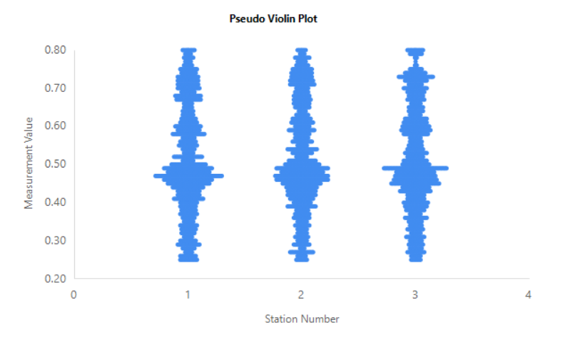
A couple years ago, I received a request to build an SSRS report which would display a violin style plot. In this case, close enough would suffice. It didn’t need to implement a violin plot exactly. The purpose was to visualize a set of pressure measurements across a set of stations.
Violin plots are similar to box plots, except that they also show the probability density of the data at different values, usually smoothed by a kernel density estimator.
Basic Query
|
|
Design Notes
The y-axis simply plots the actual measurement value.
The x-axis is where the “magic” happens. This assumes stations are integer style numbers, preferably consecutative integers. However, the concept would still work with non-consecutive integers, the graph just might not be as pretty.
The formula in the query to calculate the X value is cte1.StationNumber + ((cte1.RankOrderMeasurement - 1) * (0.3 / t2.MaxRank) * IIF(cte1.RankOrderMeasurement % 2 = 0, -1, 1)) AS X
I want the values for Station Number N to be centered over the number N on the x-axis thus the first piece StationNumber + (STUFF).
The 0.3 factor means the values can be spread from approximately N - 0.3 to N + 0.3 on the x-axis for Station Number N. I want the Y value with the most points to be the widest part of the violin plot. The modulus of 2 is to plot points alternating on the left side and right side of N.
Sample Output